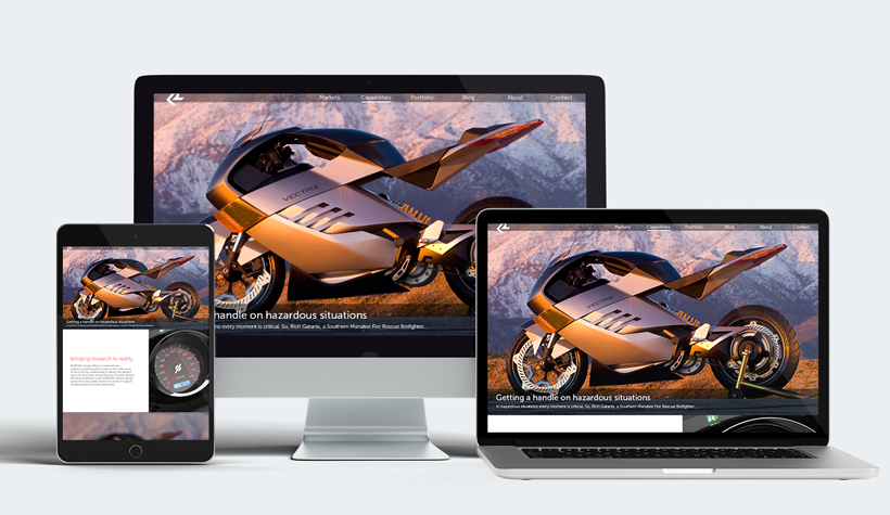
ROBRADY design — 2018
Some time after I was brought onto the ROBRADY team, I was tasked with redesigning our corporate website. I was enthusiastic and up to the task to create something new, so in these designs, I aimed to create something more modern, while using dynamic shapes and colors (and our "ROBRADY Red") to represent our love for industrial design. These designs were created and refined with the feedback of ROBRADY team members.
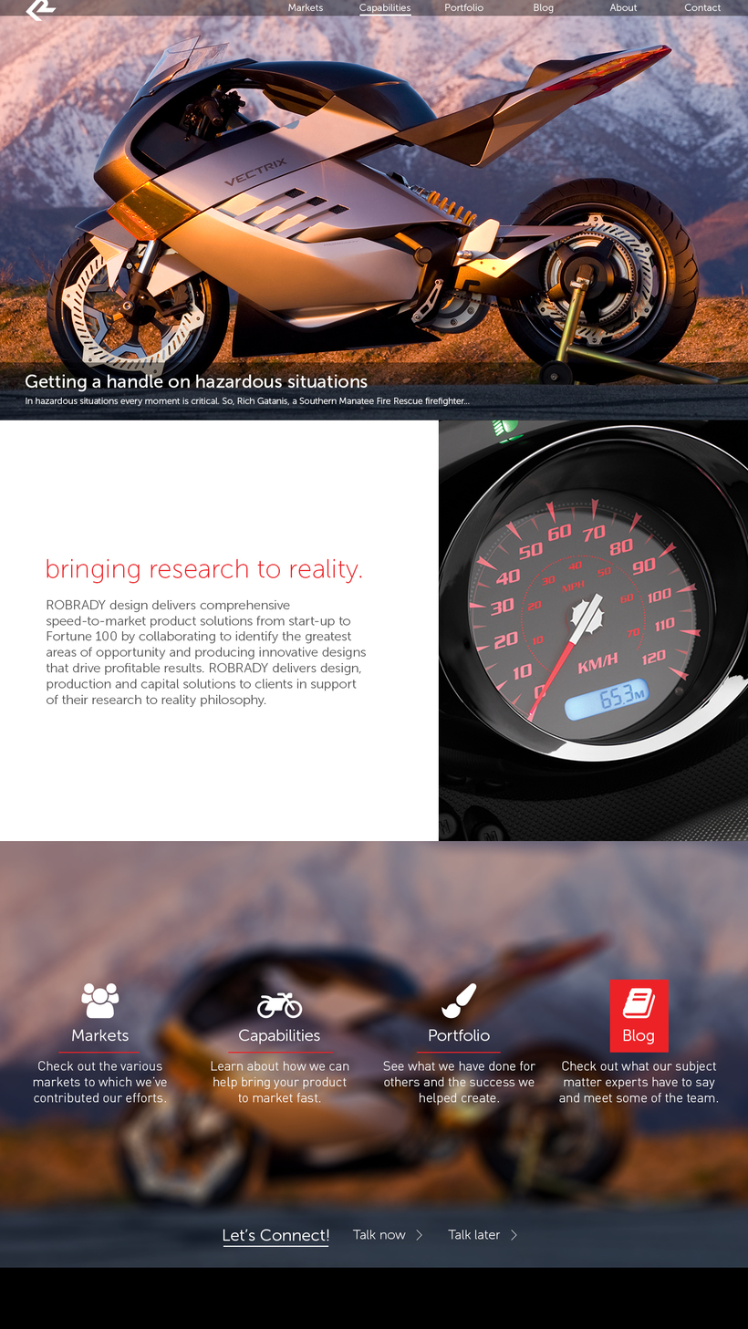
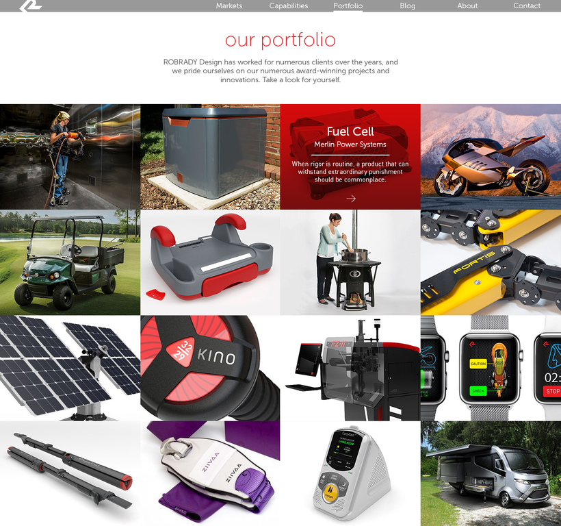
The key issues I identified were simple, but important. The website previously didn't have as much of a focus on portfolio content as it deserved. Plus, it had been a while since the ROBRADY website got a facelift, and the team thought it was time to freshen up.
If there’s one thing I learned in my design career thus far, it’s that sometimes, it’s good to go big or go home. The CEO himself, Mr. Rob Brady, is all about the big picture (literally and figuratively), so to match that, I chose to make the website scale to match the device’s viewport, with the images and select content proportionally scaled to match. I also considered the main types of content being shown to the viewer, which are both portfolio images and blog posts. With this in mind, I designed the site in a way that properly showcased the best of ROBRADY and their latest ventures.
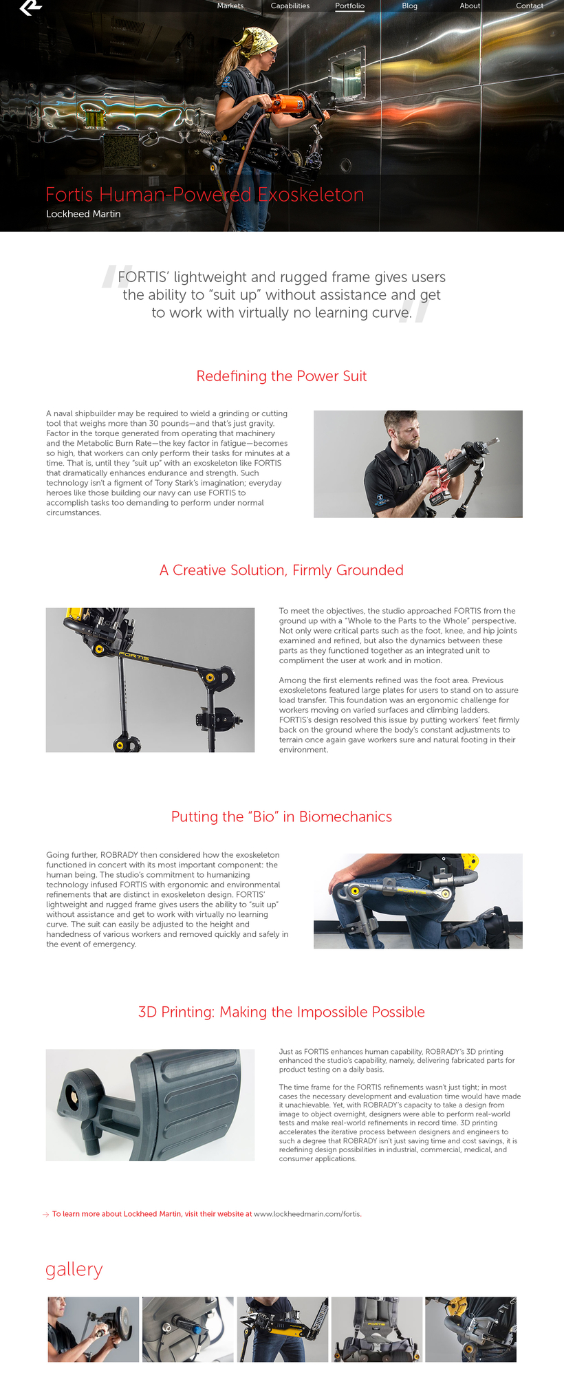
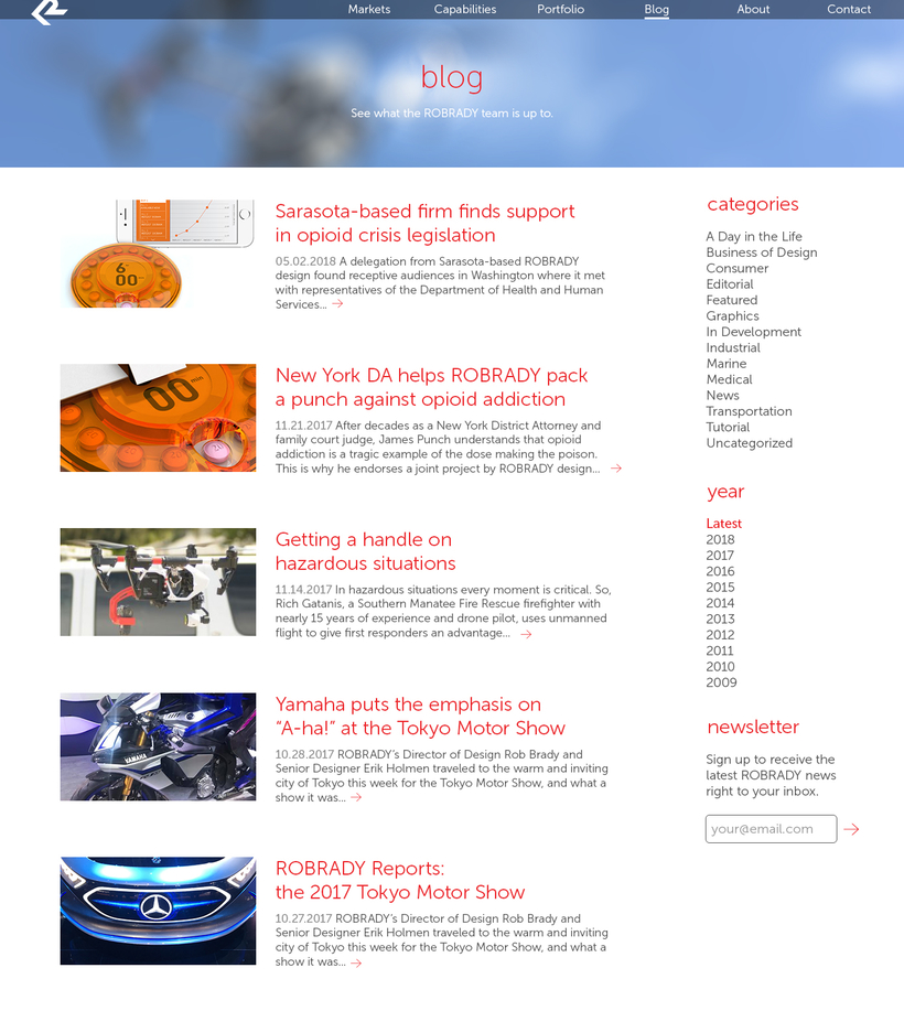
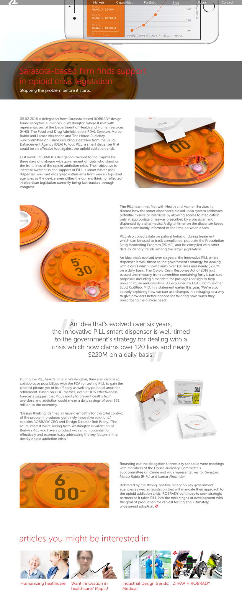
The most valuable lesson I’ve learned as a designer thus far is to think about your project from a clients or audience’s point of view. For me, this meant thinking about the most important information you wish to convey, and how to best communicate it in a way that feels appropriate to your company or brand. ROBRADY, as a company, is big, bold, and innovative, and what better way to express that than showing that personality through their website?
